
5 Things You Must Have On Your Webinar Landing Page To Double Conversions Instantly
Webinars are the most powerful and effective tools for a digital marketing campaign. Statistically, a good webinar (you can read more about creating good webinars here) not only helps you connect with your audience while establishing your authority and expertise, it also boasts one of the highest ROIs of any marketing medium.
In this article, I’m not going to talk about hosting a successful webinar, as I’ve covered that previously. Today, we’re going to tackle the biggest initial hurdle to any live event – the audience.
After all, you may well have the strongest and most valuable webinar on the planet. Your free event may change lives and provide thousands of dollars worth of value. Unfortunately, none of that matters unless people are watching it. You must have an audience.
But how do you get an audience for your live event?
With a profoundly powerful landing page. Follow the formula of the most important elements you must include on a high-converting landing page, and you’ll start building your webinar audience in no time.
What Exactly Is A Landing Page?
Let’s get the obvious out of the way. Just why do you need a landing page for your webinar?
A good landing page serves a specific purpose. Usually it’s for lead generation, to collect sign-ups and increase subscribers of a newsletter for a follow-up email marketing campaign.
A webinar landing page not only builds your subscribers, but also upsells your free event. We use strong, attention-getting headlines, compelling content that states the value of the event, and an enticing call to action (CTA).
People don’t read every word even on the most professional, expertly written landing pages, so we want every visitor to scan the page, understand the value to their lives, and get them excited about the event as they sign up.
In general, people love webinars. It’s well known that a decent webinar will educate (and hopefully, entertain as well) and toss out quality content before the sales pitch.
A webinar landing page can be set-up in ten minutes using pre-designed templates from any number of sources. As a ServerWise client, you may use the many landing page templates included with Elementor Pro or one of the over 50 we include with our Funnel and Landing Page software.
5 Components Of A Super Successful, High-Converting Webinar Landing Page
A strong webinar landing page is designed to attract and convince visitors to sign-up. It’s important to keep it simple.
What’s In It For Me?
Clearly list the value the attendee will get from your webinar. Emphasize the benefits and make it personal. Try to use “you” and “your” as much as possible. You want your landing page visitor to feel that this webinar was created for them. That you’ll solve their problem and alleviate a pain point in their life.
1. Define Your Audience
First, we must determine your exact targeted audience. Who is your buyer persona, and who will get the most benefit from your webinar?
Ask yourself the following:
- Is your webinar more beneficial to a certain gender?
- Does your content have a relevant age range?
- Are you only targeting a specific country or language?
- Just what are their pain points?
- Does your audience have anything in common, such as hobbies or particular interests?
- What exact field or niche is your webinar designed for, and will anyone beyond that benefit from it?
Before you can start a targeted digital ad campaign through Facebook, Google or other social media (such as TikTok), you need to know exactly who you created this webinar to help or educate.
The more specific you are with your intended audience, the more targeted your online ads will be. Hyper-targeting when running paid ads will save you money and maximize your sign-ups. Regardless of the platform running your webinar ads, you’ll be able to target by gender, age, location, language and even interests or hobbies.
2. Write Dynamic, Sizzling Headlines
Inarguably, headlines are the most important component of a successful webinar landing page that converts. Visitors won’t read all the content, but they will scan your headlines, all of them, make sure they’re powerful.
A good headline is simple, straightforward, and to the point. You want visitors to your landing page to connect immediately with your event.
7 tips for strong, impactful headlines on your webinar landing page:
Keep it simple, but use powerful, eye-catching sentences. Short is preferred, but keep the length it must be to fully convey the offer and benefit instantly.
Use strong verbs like “Start generating X today with our proven system six months in the making”.
Try to include numbers in your headline, they provide specificity which makes people feel more secure. Headings like "11 Secrets" or "The Top 5", or even just “3 Simple Steps” will always attract more attention over headlines that don't use this tactic.
Don't sell. Remember, your webinar landing page is to entice and convince, not to sell. Don't be pushy and don't include any sales pitch. Keep the focus on the value and benefits and not on the product or service you are using the webinar to sell. Now is not the time for your sales pitch. Stay on the problem you're solving for attendees and don't deviate.
Try to include a question in your headline. Headlines that are questions outperform even the boldest statement based headlines.
Don't use a passive voice. Your headlines must be short, direct and concise and instantly show your expertise and authority. Passive voice does the opposite..
Include the key benefit in your headline. You could use phrases like “learn how to…”, "skyrocket conversions with...", “get more sales using…” etc.
3. Write Sales Copy That Demands Attention
Landing pages are not articles, meaning you must be very direct and straight-forward. Get to the point immediately or your visitors will lose interest and leave your site (which also increases your bounce rate)
Include a powerful and bold headline as mentioned above and move right into the value and benefits of your webinar.
Speak directly to your potential webinar attendee. This page has only one purpose – to convert visitors to event registrants. You’ll want to personalize the page by making them feel included with words like “you”, “your”, and “yours”. Write the content as if you’re speaking to an individual directly.
Top 3 Things Not To Do:
- Don’t sell
- Don’t market
- Don’t overpromise
Never include a sales pitch on your webinar landing page. In fact, if your landing page sounds similar to your sales pages… start over.
Remember, you’re not selling anything on this page. You’re communicating exactly what amazing free things an attendee will learn or experience by registering and joining the event.
If your webinar landing page sounds sale-y to a visitor, they will leave.
Keep the page polished and professional while maintaining your brand identity, and just make sure to include the benefits section. Visitors expect a quick bulleted list they can easily scan with all the incredible things they’ll get out of this webinar, all for free.
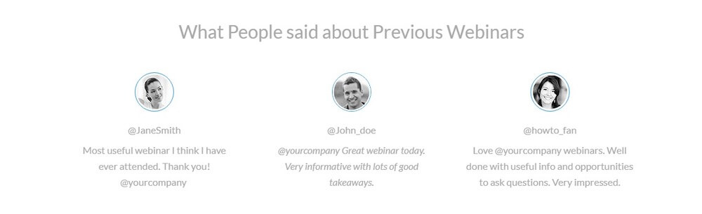
Include Social Proof
Add testimonials to the landing page as social proof. You may choose to include screenshots of comments made by current customers from Facebook, Twitter, etc.
Social proof is crucial. It convinces your visitors that you have the experience and credentials to actually help them in some way.
Your social proof doesn’t need to relate to your current webinar or product. You can use testimonials, social media comments or tweets from an event you held two years ago or even your own Facebook page. As long as the comments are about you or your brand, use them.
5 Tips For Strong Webinar Landing Page Copy
- You want the landing page to sound professional but natural. Focus on content flow from the top to bottom of the page and make sure it all fits together nicely with copy that sounds conversational and human.
- Employ the powerful FOMO (Fear Of Missing Out) tactic to magnetize your visitors and convince them to sign up for the webinar. What if they don’t sign up today? How will that change their lives? What will they be missing out on while others attend?
- Use a real deadline and stick to it.
- Your Call To Action (CTA) should include a strong action verb that directly instructs your visitors exactly what they must do next.
- Use Google’s PageSpeed Insights tool to make sure your page will load quickly on all screens and devices, everywhere. Take Google’s suggestions and make changes until the page is fast is optimized.
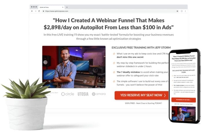
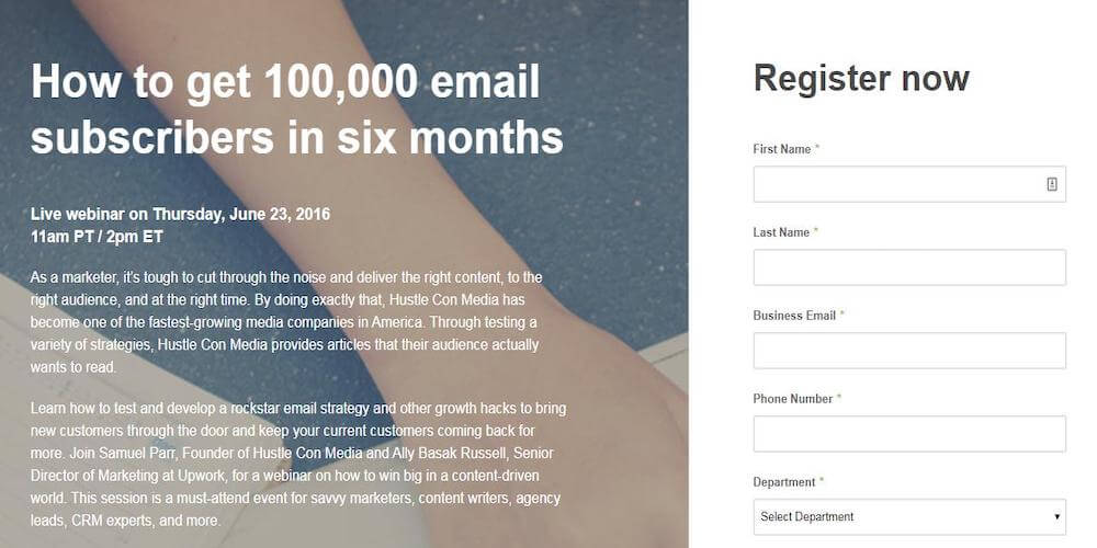
Take a look at the landing page by Upwork below. “How to get 100,000 email subscribers in six months” is a powerful headline. It’s focused, plainly stated, and immediately conveys the purpose of the event. Also notice the bold green CTA button on the white background. That gets attention! You’ll also notice that the page is concise and clearly lists the benefits of attending this webinar. That’s a good use of a bulleted list right there.
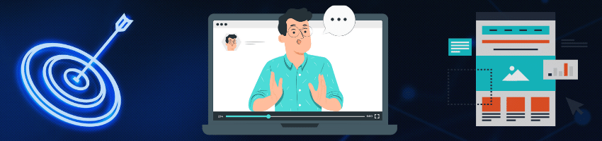
4. Add Strong Visuals
Strong, relevant visuals are a must for a webinar landing page built to convert. According to HubSpot, when information is supported to a related image, people will retain up to 65% for three days. Without an image, the retention rate drops to only 10%.
Needless to say, it’s not just important to have good images or video on your landing page, but it’s good business.
Add graphics (preferably original, if possible) that are relevant to your webinar topic and relatable by your audience. These images should also help communicate your message. Photos, graphics or videos are all beneficial, but they can’t stand out. Make sure they fit with the page, content and your brand.
While I do understand the desire to overcompensate and add as many images as you can, don’t. Less is more. Two strong images will stand out and get noticed. Ten images become clutter.
A single video on your landing page can increase your conversion rate by as much as 80%. The video doesn’t need to be long, in fact, keep it short. A quick video welcoming visitors with a short explanation of your webinar benefits and contents is all you need. Remember, if you’re excited in the video, your visitors will get excited. Excitement is contagious.
If your webinar has speakers or one main host who will be on camera, include photos and a brief biography detailing why they are an expert on the topic. This will establish their credibility and authority.
Adding a video from a past session can help potential registrants get a sense of whether this event provides anything of value.
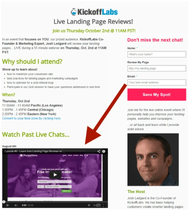
If this is your second webinar, I strongly suggest you use a few minutes of your previous webinar in your video. This gives a sense of your style, leadership type, and previous experience. Essentially, you are providing your own social proof, just as Kickoff Labs did below in the screenshot of their landing page.
5. Include An Irresistible CTA
It’s now time to focus on achieving that final conversion – the registration. We do this using a powerful CTA or Call To Action. The only purpose of a CTA is to direct and convince visitors to follow a specific action, like signing up for your webinar.
Your CTA needs to stand out and be noticed almost immediately. It must be bold and highly targeted to your audience. It’s the only component on your landing page that doesn’t need to fit your brand identity, after all, we want it to get as much attention as possible.
I’ve compiled a list of CTA best practices to help guarantee your success:
- The CTA should include only the desired action that focuses on the next or final step like “Get More Subscribers”, “Join FREE Masterclass”
- Motivate action by using command verbs like “register,” “enroll,” “grab,” “reserve,” etc.
- Use colors that are bright and stand out such as red, yellow, orange or vibrant green.
- You can use arrows on your CTA button to visually appeal to the visitor’s desire to move to the next step or go forward in the process.
- Create a sense of urgency with countdowns, timers, or a limited number of seats.
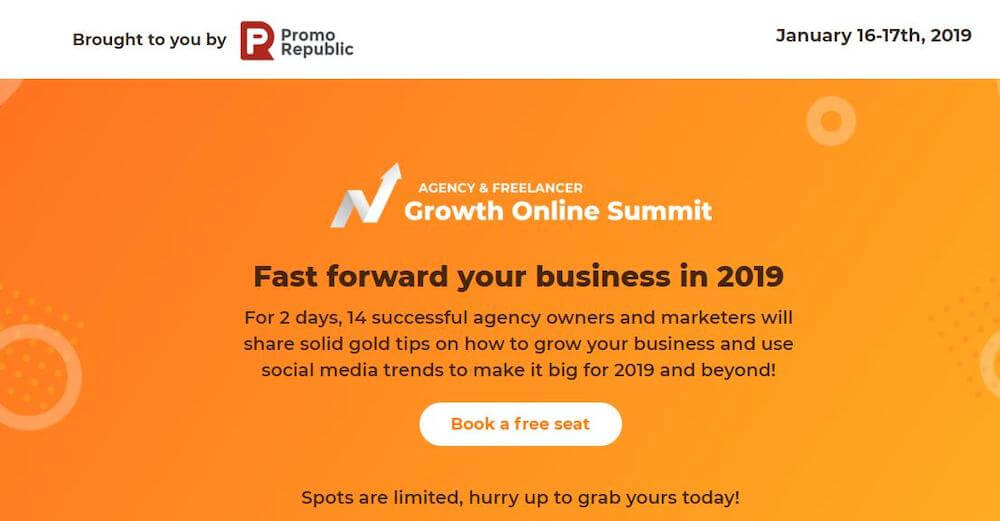
In the example below from PromoRepublic’s webinar registration page, we see the bold, compelling CTA. IT’s placed at the top to stand out, and it does. Also take note of the fact that they used the CTA to remind and emphasize that the registration is free but directly below that button is, “Spots are limited, hurry up to grab yours today!“. They combined a sense of urgency with the CTA which drove higher conversions.
The Review & Wrap-Up
The very best webinar or live event is meaningless if you have no audience to watch it and potentially purchase from you. It’s every marketer’s nightmare!
To ensure you never experience this horror, you need a solid webinar marketing strategy and campaign. Your landing page is the most important and valuable resource you have to power conversions and pack your next webinar with hungry audience members.
It’s not quantum physics. Just keep the following in mind and read over this article another time or two, and you’ll be creating highly converting webinar landing pages within the next three days.
- Clearly define and know your target audience (buyer persona)
- Write compelling headlines and test them
- Write and rewrite powerful copy
- Add images and one video (less is more powerful)
- Include a strong call to action that can’t be ignored

Free trials are tough with successful conversions barely getting by at only 11%. But there are things you can do to improve your odds. Keep Learning >

Software-as-a-Service companies are everywhere, for a very good reason. Over 10,000 are vying to become the next $1 Billion darling. Keep Learning >