


Updated: January 15, 2021
Before You Jump On The Mobile Bandwagon, Know The 5 Biggest Pitfalls You Must Avoid
Table of Contents
Having a mobile experience and having an effective mobile experience often look very different. Merely having a mobile site at all isn’t enough these days. Consumers expect a mobile first strategy for most businesses, and those that don’t heed to consumer desire are doomed to fade away (Blockbuster Video comes to mind).
Before we get to the pitfalls let’s go over the important points you’ll need to remember as you build out (or supervise) your mobile presence.
Important Mobile User Experience Reminders
Stay focused on your core features and keep an eye on the purpose of your mobile site.
You have a lot less space on a smaller screen to impart that valuable information so keep it succinct and practical. Remove all the unnecessary (but no doubt impressive) photos and keep to only image per piece of content. Remember not everyone will be using their mobile with a high-speed data plan.
The enlarged screenshot below is the Travel Texas website (an homage to our many ServerWise employees in the Lone Star State). The Office of the Governor, Economic Development and Tourism emphasized the mobile version of the site because they knew most people would be accessing it while on the road – and that meant on their smartphones.

Test out the click-ability of your links.
Cluttered and tight links are a common issue on mobile devices. Human fingers vary in size (and girth) so don’t crowd your mobile links. Leave enough space between them, so even the biggest fingers can target and click the desired one.
Large buttons in a vertically stacked menu make links easy to target and click with precision. One frustrating experience on your mobile site and chances are that user won’t be back.
Keep your mobile site simple so it loads fast. Speed is important.
The time it takes a page to load is always important, but it’s the most important on mobile. In fact, a slow loading sites is often the top reason visitors bounce right off your site to another.
Think of it this way. When you’re alone and sitting in front of your laptop, and it takes two seconds for a site to load, you may get a little annoyed, but you wait.
Mobile users are on the move and because of that their impatience has risen considerably. A mobile user expects a site to load in 1 second.
I know it’s easier said than done, but look at it as a challenge. Disable as many plugins (if you use WordPress which I highly recommend) as you can for the mobile version.
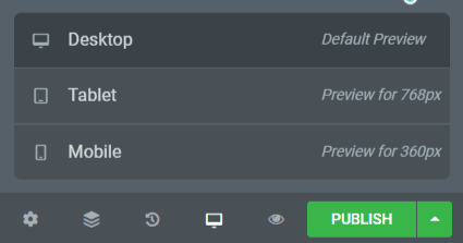
If you’re using Elementor on WordPress, you can preview your site in all three modes (desktop, table and mobile) and hide all unnecessary elements on the mobile version.
Top 5 Mistakes Even Great Companies Make When Going Mobile
Lack of Scalability
Think about the future of your site and user experience. How scalable is your architecture and platform?
If you’re using WordPress on the ServerWise platform you’ll be fine, but if not, consider the evolution of your mobile site. You’ll need to make changes quickly across your entire mobile atmosphere. Can you site instantly respond and resize if the next popular phone has a screen half the size?
What happens when Apple introduces the next generation of iPhone with a display that’s crisper and clearer than even the current leader, retina?
Too Much Functionality
You can’t think of your site’s mobile version as an extension of your full desktop version. It’s not, and it shouldn’t be. Mobile is compressed. It’s handheld and small, and not all features of your site will translate properly. The mobile version of your site must load instantly and be the most practical and efficient version of your site experience.
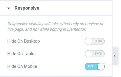
If you’re using a WordPress builder such as Elementor, this is an easy fix. With Elementor, you need only click on any page element (a resource heavy slider, for example) and select the Advanced tab. Choose Responsive in the Advanced menu and instantly toggle off the visibility to your end user on mobile, table or desktop devices.
Dumping Content From Your Full Site to Your Mobile Site
A common mistake is the lack of understanding over the difference in mobile website browsing versus desktop browsing. A mobile user has a small screen, limited resources and may even be in a public place. That individual doesn’t want or expect to have access to the same content, configured in the same way, as on your site.
The touchpoints that work brilliantly on your full website won’t work correctly for a mobile user. You’ll need to remove some touchpoints such as pop-ups and call-to-action boxes where the ‘X’ to close is simply too small for a mobile user to use.
Not Recognizing That Mobile Audiences Have Different Needs
Your mobile users aren’t using the site in the same way as your desktop users. They’re killing time and want instant access to everything. They don’t need bells and whistles, just real engaging and consumable content that will keep them preoccupied for five to ten minutes.
Your mobile user is, quite literally, mobile. Walking or riding as they interact with your site. You need to keep their attention with immediate content that delivers value.
A small mobile screen has a small above the fold region. That gives you little area to get your point and purpose of your site across to the mobile user. Make sure it’s fully optimized.
Not Having A Mobile Marketing Strategy
With millions of brand vying for mobile users’ attention these days, offering a responsive and scalable mobile site isn’t enough. You need to view the mobile users from the marketing side of the experience.
How will you change your digital marketing campaigns to target and attract mobile users?
How can you use mobile technology to identify marketing challenges and move to meet them accordingly?
That mobile device is with us always – carried in our pockets and used more than any other these days. How can you enhance that experience and add value to a user?