


Updated: March 6, 2021
Nonprofits Can Use Infographics To Prove Community Impact And Increase Donations
If you are reading this article, chances are you are part of a nonprofit. You spend your time helping and because you’re in the thick of it, you know just how much good your charitable organization does. You know the difference your nonprofit is making in the community.
The problem is that the community itself often doesn’t understand the difference your organization makes. And that’s a shame that we’re going to fix today.
There’s an easier way to spread awareness of your nonprofit, to prove just how valuable the work you do actually is, and to use that to increase donations.
People prefer to donate to organizations that they know are legitimately helping their community and making a difference. This is where the power of the infographic comes in, after all, the infographic is an easy-to-understand form of visual storytelling. And people love a good story.
When creating your infographic to spread the value of your nonprofit, you’ll want to keep the following four things in mind:
1. Keep it simple and short. People have short attention spans.
2. Focus on your benefactors. Show donors how much of an impact their donation makes and where it goes.
3. Showcase one piece of data. Too many numbers are confusing. Choose one statistic or data fact and highlight it.
4. Emphasize results in a clear, concise message. Typically, an organization reserves it’s financials, usage of donations, community impact, etc. for a downloadable white paper. But no one reads those. Everyone likes infographics, however.
How To Design Your Nonprofit's Infographic Marketing Campaign
Let’s get straight to it because you have far more important things to do with your time like helping others.
Keep It Simple And Short
Think of your nonprofit infographic as a movie teaser. You need to maximize the impact experienced by the reader in the least amount of text. The more you push on your audience to read, the less likely they’ll pay attention to your infographic, let alone save it, share it and eventually donate.
The goal is to create a visually appealing infographic using as few sentences as is possible in order to attract eyeballs and draw in interested and empathetic donors.
Take a look at the following infographic from Compassion International.

The infographic is short, straight-forward and easy to understand. It also draws you to it with poignant, appealing visuals. It tells you everything you need to know about the organization and the massive difference sponsoring a child makes in the child’s life.
Compassion International set the bar high for nonprofit infographics and had a viral hit with this one as it has been shared on Pinterest and Facebook tens of thousands of times worldwide.
The organization launched a program called Compassion’s Complementary Interventions and needed an engaging, simplistic way to explain it while getting people involved. Once again they turned to the power of the infographic, and once again they were able to build on their previous success. Take a look at the infographic they came up with below. You’ll notice it’s a slightly different approach this time as they needed to educate the audience first using bright colors and strong images.
Focus On Your Benefactors
You want one central point above all else – the difference your benefactors make to those you help. Be succinct but intense, and showcase using strong visuals how much a donation does and how far it goes. Let your donors see that they are your nonprofit’s VIPs and you need them. Essentially, make them feel important and emotionally connected to your organization’s mission.
The organization, No Child’s For Sale, has done a fantastic job with this using strong visuals presented in an emotional way. The following infographic highlights the problem and gives specific ways one can help, while presenting how much of an impact that help has overall.

This particular infographic is shared, liked and linked to routinely on Facebook and Pinterest, which in turn has also increased the organization’s SEO and page rankings in Google through backlinks.
But No Child’s For Sale didn’t stop there. The organization had to find a more simplified and engaging way of using one simple image to get people to share the link on Twitter and throughout Facebook Groups. Here’s what they came up with, proving that it only takes one strong image to induce and emotional response.
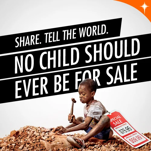
Notice the very first word on the image is a strong action word – SHARE. Asking people to share does work, after all, it only takes a click and a repost so most are happy to do it.
Showcase One Piece Of Data
People get overwhelmed very easily, and that tends to cause a person to shut down emotionally. You want to create an emotional response in the reader without driving them into a hole of hopelessness or suck them into a vacuum of stats and data.
Here’s a good example of a quick mission statement, so it’s very clear what the organization does without confusing people.
Emphasize Results In A Clear Concise Message
Here’s your chance to concisely inform your donors where their generous donations are going and what larger impact the organization is having because of them.
In digital marketing, we would refer to this area on your infographic as the Call-To-Action. Prove to them how much you need them and how responsible your organization is with their donations, and convince them to donate even more.
No one wants boring financial charts full of expenditures and rising raw material costs. Even though that’s all true and important, your donors don’t care about that. Show them in the easiest format possible how much good you can squeeze from each of their dollars.
These short and poignant infographics are very popular on social media. You’ll get some Facebook and Pinterest shares for sure and remember, the more shares, the wider your audience and possible donor base.
Below is a great example of this style of infographic done right.
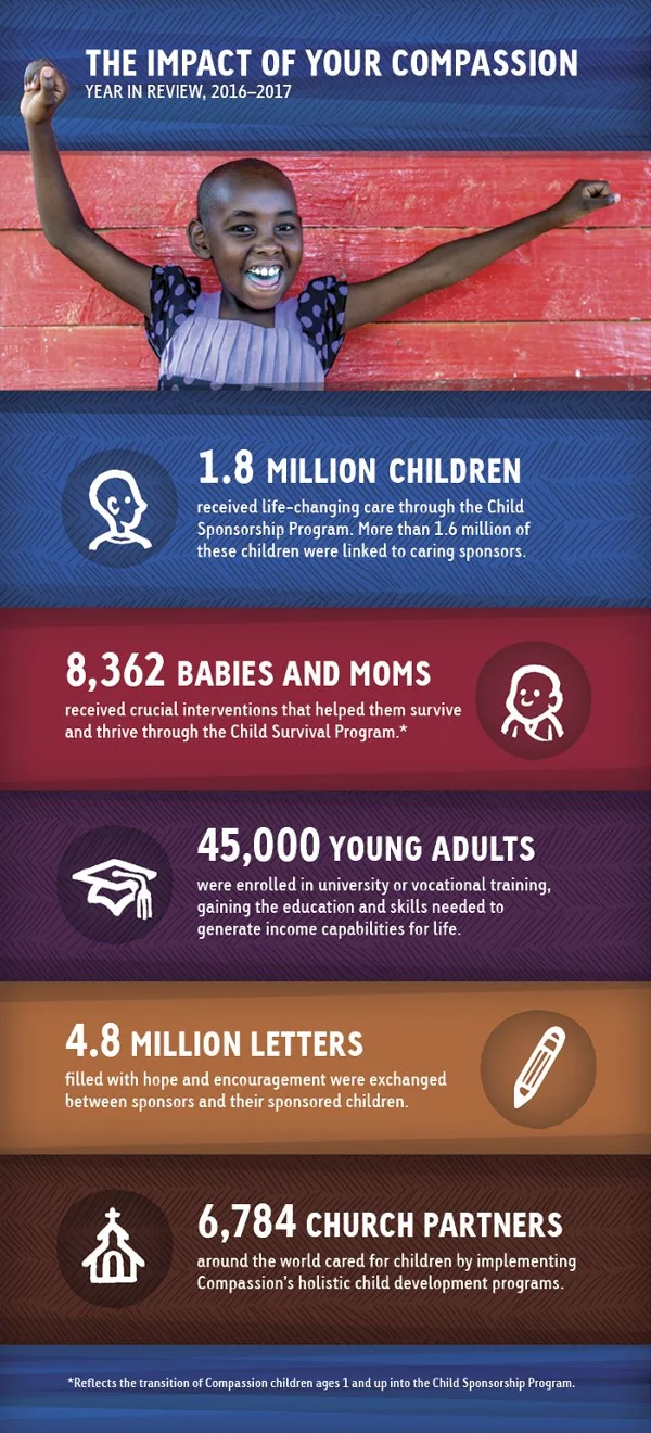
They cut right to it starting with the headline, “The Impact Of Your Compassion“. Short and emotional while drawing the reader in and incentivizing them to become part of the mission.
The Big Wrap-Up
Organizations that use infographics and visuals in their for-cause marketing campaigns on social media and via email experience a 38% increase in engagement.
That may well translate to a 38% increase in donations, volunteers and community awareness. Surely it’s worth a try!
Step into infographic use for your nonprofit with confidence. You do great work for a great cause, and it’s time everyone in your community knows about it. Help them to help you by increasing awareness through strong visuals and visual storytelling using infographics.


It’s the sales page where the magic happens. This is the page that gives you a return on your marketing investment. It is on this page where we convert visitors to paying customers. Do you know the valuable elements of a high-converting sales page? You will soon. Keep Learning >

Content marketing is the backbone of the biggest success stories over the last decade. I’m referring to companies like Zomato, Canva, ThinkGeek, HootSuite and even Blendtec. It’s not surprising that so many brands are focusing on content marketing, given the average ROI is twice any other type of digital marketing. Keep Learning >